Business Intelligence Software (BI)

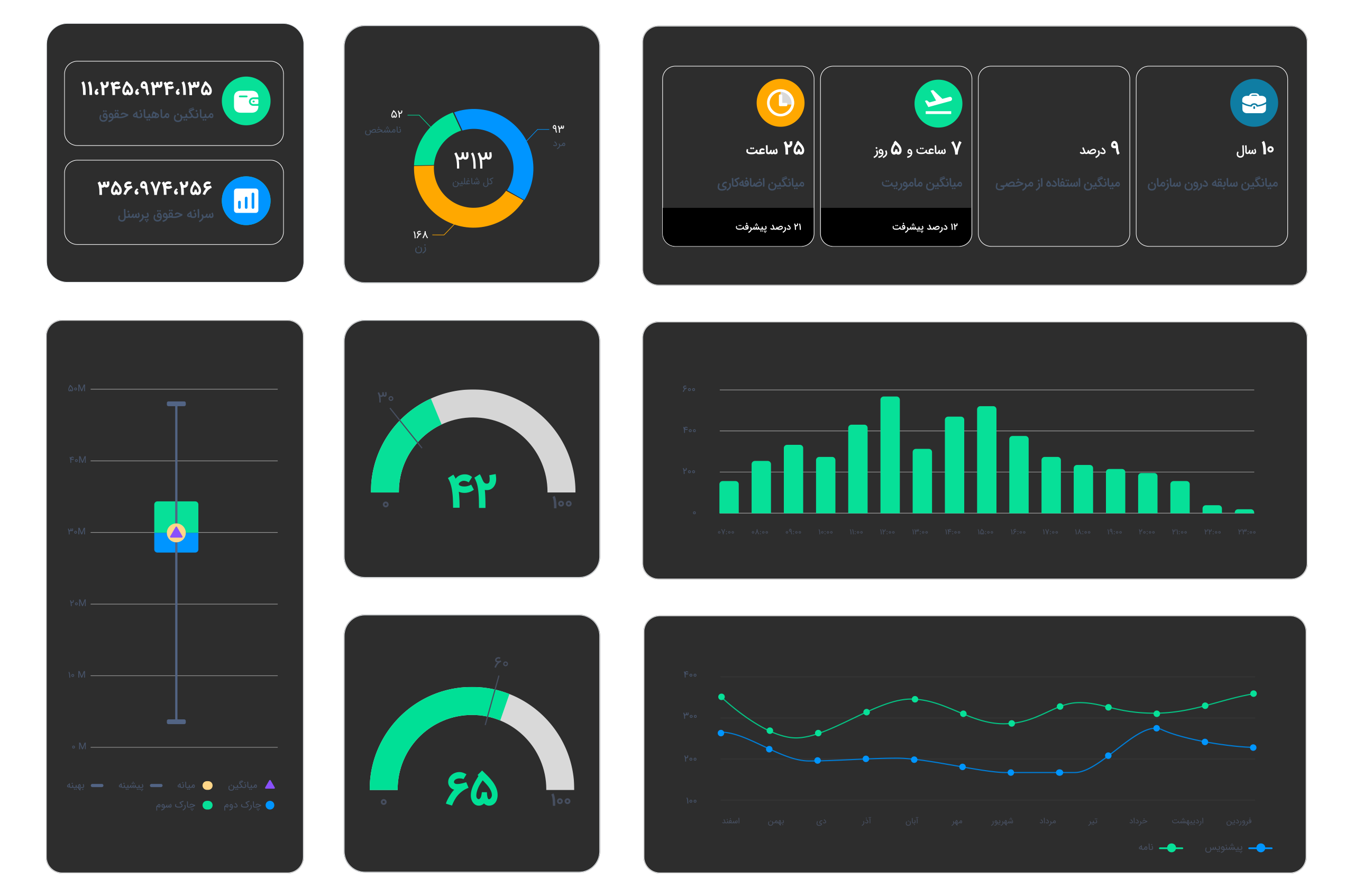
In order to grow and compete, organizations need to make decisions based on facts more than ever. For years, valuable information has been stored in various organizational systems: from human resources and budgets, to property, real estate, accounting and correspondence processes. But just having data does not mean having insight. Many organizations experience a serious gap between the data they have and the insights they need. Chargoon BI Business Intelligence bridges this gap. By seamlessly collecting and analyzing enterprise data, Chargoon BI enables a comprehensive and accurate view of resource status, trends, performance, and deviations in the form of analytical dashboards. These dashboards not only provide descriptive information, but also equip managers with actionable, forward-looking insights by analyzing trends, intelligent comparisons, and key performance indicators.


Business Intelligence Software (BI)
Share
Detailed Analysis, Comprehensive View, Informed Decision

In the Chargoon BI ecosystem, data is no longer simply archived or unanalyzable; Rather, they become tools for clarifying the situation, controlling deviations, making more accurate predictions, and making more effective decisions. From project resource control to personnel performance analysis, from human resource management to their evaluation; everything is based on data and serves decision-making.

But the fundamental question is:

Is this data just for archiving? Or can it be a tool for intelligent decision-making?

Business Intelligence (BI) is a precise answer to this need. BI is the process of structured data analysis to extract actionable information from raw data; information that allows managers to make faster, more informed, and fact-based decisions. Chargoon BI dashboards transform your data from the current state to the future by providing analytical models and visual views.

Challenges of Decision Making Without Analysis

In many organizations, a large volume of valuable data is stored in multiple systems; but the lack of an analytical and integrated view prevents this data from being transformed into effective decisions. Chargoon Business Intelligence turns these challenges into opportunities:

Chargoon BI Dashboards in Different Domains
  • Office AutomationOffice correspondenceThe Works
  • Human ResourcesPersonnelPresence and AbsencePerformance EvaluationSalaryComprehensive Management
  • Financial ManagementGovernment Accountingbudgeting and appropriationsContracts
  • LogisticsReal EstateProperty Management
  • Business Process Management (BPMS)

    Draft Volume Dashboard

    This dashboard identifies the busiest and most trafficked areas of an organization's correspondence by providing statistics on the number of drafts and their circulation. Using this information, the need for auxiliary tools, correspondence balancing, and correction of the draft-to-letter conversion rate can be identified.

    Agility Dashboard in Drafts

    This dashboard examines the organization's time performance in registering, circulating, and converting drafts to letters. Agility and quality indicators make it possible to find slow bottlenecks in correspondence processes that require correction.

    Mail Volume Dashboard

    Focusing on the number and type of letters, the correspondence process in the organization and high-traffic departments is examined. This dashboard provides a tool for analyzing the increase or decrease in organizational communication and the balance of human resources in the involved departments.

    Agile Dashboard in Mails

    This dashboard provides a detailed assessment of the response time, referral, response and closure of letters. With its help, it is possible to identify slow units, functional bottlenecks and training or tool needs in the response process.

    Comprehensive organizational view dashboard

    This dashboard provides a combined and comparative look at the performance changes of the organization in two consecutive months. Its purpose is to continuously monitor the level of agility and evaluate the effectiveness of corrective actions at the overall level of the organization.

    The data analytics dashboards in the Tasks software are built on the Didgah Data Warehouse infrastructure, enabling managers to gain a comprehensive overview of team, project, and task performance across the organization at a glance. As the first phase of analytical maturity in Kār-hā, these dashboards empower you to monitor team efficiency, identify bottlenecks, and make more informed, data-driven decisions.

    Employee Dashboard

    This dashboard provides a comprehensive view of the current status of the organization's employees; including age, education, gender, and work history. The goal of this dashboard is to analyze the human resource structure to predict retirement, improve human resource retention, and plan for succession.

    Recruitment Dashboard

    With this dashboard, you can review the details of human resource recruitment in terms of time, individual characteristics, and location. This information helps identify peak hiring times, the age and education balance of new recruits, and the alignment of recruitment with unit needs.

    Attrition Dashboard

    This dashboard provides a detailed analysis of the process of leaving the organization. By identifying time patterns, likely reasons for leaving, and groups at risk of attrition, organizations can take proactive steps to retain key talent.

    Attraction Ratio and Exit Rate Dashboard

    By comparing recruitment and attrition rates over time, this dashboard provides a snapshot of an organization’s growth or decline. Managers can assess the sustainability of their human resources and make decisions about the balance of their organizational structure.

    Sum of Order Factors and Its Change Ratio Dashboard

    This dashboard is designed to analyze compensation and its changes. By examining the relationship between these factors and experience, education, location, and gender, it is possible to identify pay inequities and improve compensation structures.

    Dashboard of leave duration and leave hours per capita

    This dashboard is designed to provide in-depth analysis of leave usage and, by measuring leave hours per capita based on time, leave type, individual characteristics, and location, helps organizations identify and manage behavioral patterns, workload, and the need for flexibility across different employee levels.

    Dashboard of number of leaves and number of leaves per capita

    This dashboard focuses on examining the frequency of recorded leave and analyzing behavioral patterns within the organization. Using data such as gender, background, marital status, and job category, policies can be considered to tailor work conditions to improve work-life balance.

    Dashboard of ratio of personnel on leave to total personnel

    This dashboard provides a percentage of employees who are on leave at different times. By analyzing trends across days of the week, departments, or job levels, it is possible to identify high-risk areas for reduced productivity or workload. This data will be the basis for adjusting human resources and optimizing workforce planning.

    Employee Average Evaluation Dashboard

    By displaying average employee evaluation scores, this dashboard allows you to analyze the overall performance of employees, achieve organizational goals, and identify areas for improvement based on characteristics such as employment type, educational background, and location.

    Evaluator Average Score Dashboard

    This dashboard analyzes the scores recorded by raters to help assess the accuracy, consistency, potential bias, and influential role of each rater in the assessment process. It allows you to monitor and adjust for differences in assessment styles.

    Personnel Salary Analysis Dashboards

    A set of dashboards for accurate monitoring of the status of personnel payments and deductions. These dashboards include the following 6 main axes:

    • Gross Salary
    • Gross Salary Per Capita
    • Real Net Salary (after legal deductions)
    • Real Net Salary Per Capita
    • Net Payroll (after legal and personal deductions)
    • Net Payroll Per Capita

    By examining these indicators along with factors such as gender, experience, degree, job category, place of service, and department, macro and comparative analyses are possible.

    Mission Amount and Number of Mission Days Dashboards

    A tool for monitoring the number and cost of missions performed in the organization, with the ability to separate them by gender, experience, location of service and other key variables.

    Comprehensive Management Dashboard

    The Comprehensive Management Dashboard is designed to provide high-level executives with strategic insights through a centralized and streamlined interface. It offers direct access to key indicators essential for macro-level organizational decision-making. Within the Human Resources domain, data can be categorized into two views: “Year-to-Date” and “Last 12 Months.

    Bank Account Balance Dashboard

    This dashboard provides a snapshot of the liquidity status in all of the organization's bank accounts. By analyzing transactions, balances, and inflows and outflows, it is possible to identify unused accounts or suspicious transactions to optimize liquidity management and reduce financial risks.

    Cost Growth or Cost Reduction Dashboard

    Displays the time trend of the organization's operating expenses in different periods and, by separating categories, allows you to identify factors that increase or decrease costs. This dashboard helps to discover inefficiencies and improve budget planning.

    Dashboard of Revenue Growth or Decline

    Analyzes the organization's revenues in different time periods and shows the contribution of various projects or services to revenue. This dashboard helps managers evaluate the alignment of revenues with the organization's goals and identify opportunities for improvement.

    Dashboard Percentage Growth or Cost Reduction

    Indicates the percentage change in expenses compared to previous periods. By analyzing fluctuations and identifying warning signs, this dashboard helps to quickly identify and correct abnormal cost trends.

    Dashboard Percentage of Revenue Growth or Decline

    This dashboard displays percentage changes in revenue over time and provides a more realistic picture of the organization's financial performance by comparing it with program goals and market conditions to make more accurate development decisions.

    Current Unused Credit (riyals/percentage)

    This dashboard provides a snapshot of the remaining credit in the current budget and helps managers monitor credit usage throughout the fiscal year, prevent unnecessary expenses, and make more accurate year-end plans.

    Unused Possession Credit

    The Acquisition Credit Management Dashboard allows decision makers to be aware of the remaining status of the development and capital budget at any time, allocate resources optimally, and prevent delays in the implementation of key projects.

    Current Agreements

    This dashboard is dedicated to detailed analysis of current financial commitments and provides a clear view of the amount of registered agreements, helping managers to have a more comprehensive picture of the organization's commitments and make more accurate financial planning.

    Acquisition Agreements

    The Acquisition Agreements Analysis Dashboard allows organizations to monitor financial agreements of construction projects at the season and project level, reduce financial risks and make better decisions in the area of resource allocation.

    Statement Amount Dashboard

    The Statement Amounts Dashboard provides a real-time and clear view of the financial status of projects, allowing for precise control of payment commitments. This tool eliminates the gap between work progress and payments by displaying the approval, payment and receivables status of projects and contractors.

    The Dashboard of the Amount of Guarantees Received

    The Guarantee Amount Dashboard helps organizations maintain full control over the validity date, amount, and release status of guarantees by providing a unified, real-time view of project guarantees. This dashboard reduces risks such as missed expirations, early release, or guarantees that do not match contractors’ obligations.

    The Dashboard of the Amount of Guarantees Provided

    The Guarantee Amount Dashboard helps organizations manage their contractual obligations more accurately by providing a unified, real-time view of the amount, status, and validity date of guarantees. This dashboard reduces risks such as missed expirations, unnecessary resource blockages, contract penalties, and guarantee forfeiture.

    Dashboard of the Total Amount of Contracts

    The Total Contract Amount dashboard provides the transparency needed to better manage financial commitments by providing a comprehensive, real-time picture of the financial value of an organization’s contracts. This dashboard allows managers to analyze contract amount trends, compare projects and units, and identify cost centers.

    The Status Dashboard of a Number of Properties

    This dashboard shows the trend in the number of properties over different years and categorizes properties by utilization status (active, surplus, unused, under construction), ownership type, and usage. This analysis helps identify optimal capacities and better plan.

    Riyal Real Estate Status Dashboard

    Focusing on the total value of an organization’s real estate assets, this dashboard tracks changes in asset value over time based on property type, age, and utilization status to provide an accurate picture of the organization’s assets.

    Rental Receipts Dashboard

    This dashboard displays all the details related to the lease agreements including the number, amount and status (active, expired, renewed) and analyzes the percentage and amount of rents received and outstanding and compares the performance of the units in attracting rent.

    Dashboard of Rental Payments

    Focuses on the organization's expenses for rental properties and examines the financial information of the lease payment agreements and the status of financial obligations, allowing for the comparison of related income and expenses.

    Organization's Income Dashboard from Real Estate

    This dashboard examines the sources of income from rental and sale of properties and provides disaggregated analysis by unit, property type, use and operational status to help optimize income.

    Organization Expenses Dashboard

    A detailed display of property-related costs, including depreciation, rent, repairs, and recurring expenses, categorized by financial heading and property status, making cost management simple and efficient.

    Control Dashboard for Renovation and Repair Projects

    Reviews the time and financial progress of renovation projects, compares the planned budget with the spent budget, and identifies project deviations to optimize resource management and project scheduling.

    Asset Valuation and Depreciation Dashboard

    Reviews the current value of assets and depreciation trends, and provides information related to property appraisals to maintain valuation accuracy.

    Real Estate Purchase and Sale Management Dashboard

    Tracks property purchase, sale, and auction processes and measures the performance of these processes against the organization's goals and schedule.

    Dashboard Analysis of the Status of a Number of Properties

    This dashboard provides a clear and analytical picture of the physical status and turnover of an organization's assets. By displaying the annual purchasing trend, the separation of assets by status (in stock, in use, scrapped, etc.) and the dispersion in different units, it is possible to optimize resource allocation and control assets.

    Real Estate Status Analysis Dashboard

    This dashboard focuses on the financial value of assets and, by analyzing spending trends, the value of assets in different groups and storage locations, helps financial managers and decision makers better evaluate investments and identify financial risks.

    BAM Dashboard

    The Business Activity Watch dashboard is an analytical tool that allows for the graphical display of information related to the status of current items.

    This feature is only enabled for processes for which process execution time settings have been saved. This way, the BPMS will be able to make a comparison between the expected process execution times and the actual process execution time.

    The Business Activity Monitor dashboard consists of three reports:

    • Process BAM: Analyzes the current status of all running processes.
    • Task BAM: Analyzes the current status of all running activities.
    • Resource Monitor: Analyzes the current workload and end-user performance.
    Analytical Reports Dashboard

    Analytics reports are an analytical tool that provides a graphical view of closed instances. Analytical reports are divided into two general sections:

    • Process Analytics
    • Activity Analytics

    In both sections, it is possible to view the details of closed instances.

    Analytical reports are enabled only for processes and activities for which the "Process Execution Time" and "Execution Duration" settings have been made. This way, the dashboard will be able to compare the expected and actual execution time.

Didgah Business Intelligence Architecture

Didgah's business intelligence architecture is designed based on Microsoft BI Stack standards and aims to provide a secure, stable and analytical platform for organizations. This architecture, with its multi-layered structure, collects the organization's operational data from various sources, refines and consolidates it, and ultimately provides it to managers and experts through dashboards and management reports.

In this architecture, all key components including ETL, data warehouse, SSAS Tabular analytical model and Power BI Report Server are installed and launched on a single integrated business intelligence server. Only the operational database of the Didgah system is located on another server to prevent processing interference with the BI environment.

The Main Layers of Didgah's Business Intelligence Architecture
  • 1. Operational Database

    This layer contains the daily and transactional data of Didgah software. The data in this database is of the OLTP (Online Transaction Processing) type and its structure is designed to respond to real-time operations and organizational processes. The data in this layer is considered the main source of information transfer to the BI analytical environment.

  • 2. ETL (Extract, Transform, Load) layer

    Data transfer from the operational database to the data warehouse is done through the ETL process using the SQL Server Integration Services (SSIS) tool. In this step: Data is extracted from various sources, Then it is prepared through various transformation processes such as cleansing, standardization and aggregation And finally it is loaded into the data warehouse structure. These processes ensure that the data in the analytical environment is accurate, consistent and reliable.

  • 3. Data Warehouse

    The data warehouse is a separate and structured environment that stores cleansed and aggregated information from Didgah systems. This database is an OLTP type and is designed to increase efficiency in analytical data processing. By separating the data warehouse from the operational system, it is ensured that large-scale analytical processing does not affect the performance of operational software. In this layer, data is organized in an integrated and subject-oriented manner so that it is ready to be transferred to the analytical model (Tabular Model).

  • 4. Analytical Data Model (SSAS Tabular Model)

    This layer is considered the heart of the Didgah analytical system. Using SQL Server Analysis Services (SSAS) technology and in the form of a Tabular model, warehouse data is structured and processed. In this model: Data is divided into subject Data Marts (such as human resources, budget, contracts, and finance), Complex calculations, performance indicators (KPIs), and relationships between data are created And multidimensional and interactive analyses are provided. This model is the main source of all dashboards and management reports in Power BI and Excel.

  • 5. Presentation and reporting layer

    In this layer, data is provided to users in the form of dashboards, reports, and management indicators in a visual and dynamic way. As the main display platform, the Power BI Report Server service provides the ability to publish and view reports in the organization's on-premisess environment. Dashboards are designed in Power BI Desktop and are accessible to managers and experts after publishing to Report Server. On the other hand, organization users can design personalized reports and dashboards using the direct Excel-to-SSAS model connectivity and meet their specific analytical needs without the need for deep expertise in Power BI.

Data flow in the architecture

The data movement process in this architecture is as follows:

  • Raw data is fetched from the Didgah operational database.
  • The data is processed, cleaned, and transferred to the data warehouse via SSIS.
  • The warehouse data is loaded into the SSAS Tabular model and organized in the form of various Data Marts.
  • Processed data is made available to organization users via Power BI Report Server or Excel.


Benefits of this architecture

  • Full execution on an integrated BI server and no need for multiple infrastructures
  • Fast and optimal processing with the standard Microsoft BI Stack structure
  • Possibility of multidimensional analyses and generation of dynamic management reports
  • Ability to create custom dashboards by organization users
  • High security, stability and performance in the on-premisess environment
  • Benefits and features of Chargoon BI
  • Design custom dashboards, as easy as Excel

    Every organization has its own unique analytical needs. Sometimes it’s necessary to prepare a quick report for a management meeting or create a special dashboard to review a specific performance indicator. We’ve given you that freedom.

    By connecting Excel directly to our business intelligence platform, organization experts can design their own custom reports and dashboards without the need for complex technical knowledge. Just open Excel, connect to live, up-to-date data, and build your analysis; simple, fast, and accurate.

  • A professional backstage, a simple experience for you

    To provide such a capability, Chargoon's business intelligence infrastructure is designed based on official Microsoft standards and multi-tiered data architecture.

    Organizational data is collected from operational systems and, after the necessary processing, is provided to the analytical service in an optimized and structured format. This standard architecture allows Excel to connect to data directly, securely and stably, and you benefit from the same platform that the world's great managers use.

  • Free reporting, smart decision-making

    With this solution, you no longer have to wait for the technical team for every analytical need. Your experts can create, store, and share their own reports, tables, and charts in a familiar environment.

    The result? Faster, more accurate, data-driven decisions and an organization that works smarter every day.

To make a smart choice, consider all aspects